Over the course of four decades, the FIFA World Cup has gone from this:
To this:
That’s the difference between the 1970 tournament in Mexico and the 2014 tournament in Brazil as demonstrated by the evolution of the results chart.
What started out as a single page to record the results of the four group, 16 team event in 1970 has metamorphosed into something quite different. Like the game itself, the charts today are bigger, more colourful and more complicated.
As every fan knows, the primary function of the World Cup is to facilitate the filling in of the wall chart. It is the filling in of the chart that helps to fill in the hours between games and provides endless opportunities for rumination and speculation as the tournament progresses.
In the days before the internet, the wall chart was one of the few ways to keep track of what was happening during a tournament. It was a useful adjunct to the play itself.
Nowadays there are apps and blogs to do the work for us and so the real need to have a wall chart has been lost.
But for anybody with a yearning for a simpler time when an entire tournament took up little more than an A4 sheet, here’s a look back at some wall charts from previous World Cups.
1970
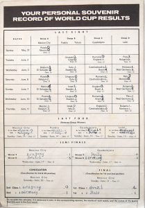 The first one in my collection is not strictly speaking a wall chart at all but rather the final page from my FKS Publishers sticker album for Mexico 70. Perhaps for that reason it doesn’t actually give the year of the tournament nor the host country; it could be anywhere or any year.
Rather touchingly, it also gives instructions as to how to fill it in… “it is necessary to note, in the corresponding squares, the results of each match…” as if the very concept of a DIY chart for recording results was something utterly new and confusing.
There were 16 teams then, organised into four groups with the top two teams in each group progressing to the quarter finals.
What is confusing is that the group games are called the Last Eight while the quarter finals, comprising eight teams, are called the Last Four. Maybe each round is referred to by the number of teams remaining at the end of it?
To give an indication of how much the tournament has changed, Mexico 70 featured one country from Africa – Morocco – while the ‘Asian’ qualifier was Israel having beaten Australia in the final qualifying game.
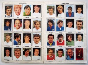
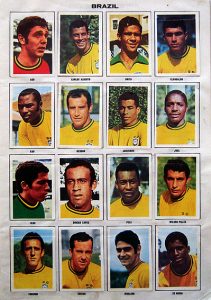
And just to show that I really did collect the player stickers for this World Cup, one of my favourite tournaments of all time, here are the pages for the England and Brazilian squads – Banks, Moore, Charlton, Jairzinho, Carlos Alberto and, of course, the unmatchable Pele.
1974
I don’t have a wall chart for this tournament in Germany, perhaps because the FKS Publishing sticker album for that year featured only a ‘schedule’ for the games with no room to fill in the results.
Despite the instructions so thoughtfully provided in 1970, the “personal souvenir results record” had failed to catch on.
1978
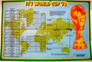 This tournament in Argentina saw my first genuine wall chart and, consequently, a big upsize in terms of space and colour.
As in 1974, the format here features two rounds of group matches with the winners of the second round groups going straight through to the final.
The chart also, rather helpfully, provides a space for recording the eventual winner, which is located just off the coast of New Zealand.
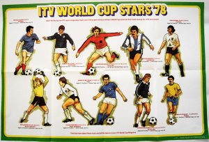
There were in fact two wall charts this year, the second featuring the World Cup Stars of ’78 who were expected to feature prominently during the tournament. Among the well-known names – Michel Platini, Sepp Maier, Rivelino – are two Scottish players (England having failed once again to qualify), Kenny Dalglish and Gordon McQueen, neither of whom had much opportunity to set the tournament alight. In fact McQueen ended up missing the entire (short-lived) Scottish campaign due to injury.
1982-86
I was moving around a lot back then. No wall charts survive.
1990
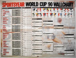 By this time the tournament (staged in Italy although, again, you wouldn’t know it) had been expanded to 24 teams and the second round of group matches had been replaced by knock-out games, much as it is today. The chart not only recorded the match results but also the tables from the round 1 games including for and against goals. Exquisite detail.
The production had also gone up a notch by this time with four colour printing enabling a photo of Gary Lineker to be used as a faded background for a tournament in which he scored four goals.
For some reason the Skol beer logo appears in the top right hand corner. No rhyme nor reason (‘Ah, just bung it in, they’ll pay good money for that.’). And this was the first and last time that somebody thought it was a good idea to include the teams’ strips.
1994
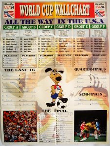 Moving on to the USA and the burning question this time around was obviously ‘What’s with the stupid mascot?’. His name was Striker and he was a dog. In so many ways. Designed by the Warner Bros animation team, one can almost imagine the brainstorming sessions that preceded it. ‘Soccer? Anybody know anything about soccer?’ ‘Well, they have these players called strikers…’ ‘Got it. Just gimme a dog.’
Again there were six groups in the first round although the chart only records the placings, not the stats, from the group games. This was the first chart to provide a space for the final’s team sheets but, in the process, it overlooked the result of the third/fourth place play-off so Sweden’s achievement goes unrecorded.
1998
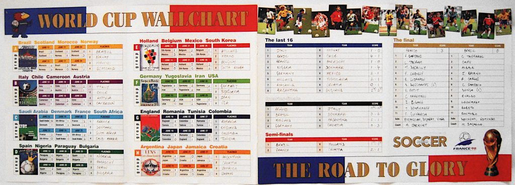
Off to France where everything goes…. sideways. Yeah, it’s not really a chart as such, more like four pages from a magazine stuck together.
There’s a mascot, too, which is a cock. No, really. He’s called Footix. (Possibly a minor character from Asterix.)
Somewhat uniquely, the chart gave unnecessary space to identifying the various venues, reproducing the poster artwork associated with each city. How very very French. Unfortunately this meant omitting the schedule of games and, again, the result from the third/fourth play-off. Sorry Croatia.
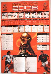
2002
Just to switch things around for Japan and Korea, this chart decided to go… tallways. And it’s not called a chart but rather a ‘commemorative program’. Pffft.
Very unhelpfully the group lists were printed fairly big with flags – which meant the game schedule itself was tiny and left no room to actually record the results. Apparently whoever designed it thought the scores wouldn’t matter until the round of the last 16. I guess another word for ‘commemorative’ is ‘useless’.
The designer was also obviously betting on an Argentina-France final judging by the pictures of Batistuta and Zidane – which was a tad unfortunate as neither side made it through the group stages.
By this time I had taken to hand writing in the result of the third/fourth play-off so at least, somewhere, the heroics of Turkey and South Korea were recorded for posterity.
2006
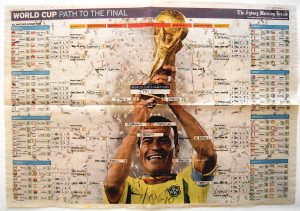 You can tell I wasn’t taking it too seriously this time around as this chart is just taken from the newspaper. It’s a real no-names effort – literally: there’s no indication of when or where (Germany) the tournament was held.
But for all it’s low-rent quality, this was one of the better charts.
Not too big, it nevertheless managed to include all the groups, the schedule, the group tables including goals for and against as well as attempting, in weirdly disjointed way, to trace the route to the final. Hallelujah, it even made space for the third/fourth play-off and, for the first time since 1978, gave a little box in which to write the winner’s name. How good is that?
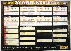
2010
Plenty of space in South Africa – this chart set a new benchmark in terms of size. I almost had to build a new extension to the house just to find a wall big enough for it.
With all that real estate to play with, it’s no surprise that this chart had practically everything – groups, tables, schedules, venues and final results – even little flags for all the countries.
It’s an opulent chart, luxurious, and obviously designed by somebody who knew their way around a World Cup wall chart.
It gave me everything I wanted but, in the process, left me feeling a little guilty at the fact that it took something so over-blown to satisfy my needs.
We’ve come a long way since Mexico.
2014
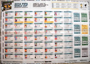 And so to the latest chart for Brazil 2014. It’s the same size as the previous one and features a rather novel design for the group stages running across horizontally for about two-thirds of it.
The downside is that there is no room for the group tables – again, I had to hand write the results – and, unforgivably, there are errors too in the scheduling and the route to the final. Fortunately, somebody on Twitter alerted me to the error before I made a fatal mistake.
Bigger and brighter for sure, but less useful and certainly no longer essential, the World Cup wall chart is at a crossroads, it’s future confused and murky. Who knows what Russia 2018 will bring? Let’s just hope it doesn’t involve a mascot.
2018
Nah, just used an app didn’t I, mainly because I couldn’t find a suitable chart. Print ain’t what it used to be.
